


Rebranding for Impact: Smart Guidelines for Pregnancy Centers
- Stories Marketing
- Aug 4
- 3 min read
For pregnancy centers, branding isn’t just about how you look — it’s about how women feel when they first encounter you. In a world full of noise and misinformation, your brand needs to stand out as a beacon of clarity, trust, and hope.
At Stories Marketing, we specialize in helping pregnancy centers rebrand with intention and empathy — so you can reach more women in need of your services. Here’s what we’ve learned works best.
1. Build Trust with a Medical Focus
If your center offers medical services, your brand should reflect that clearly. Names and messaging that include terms like medical, women’s health, or health services immediately establish authority and build confidence with your clients.
Avoid overly narrow terms like “pregnancy center” that may unintentionally limit perception of what you offer. Women are more likely to seek support from a center that appears comprehensive, professional, and medically sound.
2. Use Inclusive, Neutral Imagery
While it’s tempting to include heartfelt images like moms, babies, or religious symbols, research shows these can feel emotionally distant or even alienating for women facing pregnancy decisions.
Women in unplanned pregnancy need a space that feels safe, modern, and nonjudgmental. We recommend avoiding:
Icons of pregnant women or infants
Religious or pro-life symbols
Overly sentimental or motherhood-themed imagery
Instead, opt for clean, timeless visuals that reflect your name, location, or purpose — designed to appeal to all women, regardless of their situation.
3. Choose Fonts and Styles That Last
Trendy, thin script fonts and playful or handwritten styles can feel outdated quickly — and they’re often hard to read. Stick to fonts that are:
Clear and legible
Modern but not too stylized
Soft yet professional
Your visual identity should reflect stability, care, and competence — not fashion trends.
4. Use Color to Calm and Connect
Color sends emotional signals, whether we realize it or not. For pregnancy centers, we recommend avoiding the following:
❌ Harsh Red: Can subconsciously signal blood or conflict
❌ Neon Shades: Feel immature or overstimulating
❌ Overuse of Black or Deep Grey: Can appear cold or severe
❌ Muddy Browns: May come across as unclean or dated
Instead, choose soft, comforting tones that foster connection:
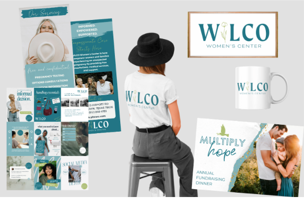
Teal: Professionalism and healing
Blush or Coral: Warmth and nurturing
Lavender or Mauve: Calm and femininity
Sky Blue or Navy: Trust and dependability
A balanced palette can convey the right blend of care and authority.
5. Name with Vision, Not Limitation
Names like “Life Center” or “Pregnancy Help” may no longer serve the broader role your center plays. Today, most pregnancy centers offer so much more — STI testing, men’s services, post-abortion care, counseling, and more.
Consider names that are:
Neutral and welcoming
Focused on women’s health or holistic care
Future-forward and mission-aligned
A name like “Trillium Women’s Center” or “Tomorrow’s Hope Medical Clinic” immediately communicates care without placing limits on your service offerings.
6. Avoid Branding That Triggers or Isolates
Many women are hesitant to reach out for help if the brand feels too ideological, too outdated, or too narrowly focused. Logos that rely on emotional symbolism (like pregnant women, babies or crosses) can unintentionally discourage contact.
Instead, lead with empathy and clarity.
Your branding should say: “You are welcome here. We’re here to help. You have options.”
Branding That Builds Bridges
At Stories Marketing, we believe your brand should reflect who you really are: compassionate, professional, and client-centered. We don’t just design logos — we craft identities that help women feel safe enough to take that first courageous step through your doors.
If your pregnancy center is ready to rebrand in a way that reaches more women, breaks down barriers, and honors your mission, we’re here to help you tell your story — beautifully and boldly.


Comments